


Owning the seller experience of a delivery platform across LATAM & South Africa
2 SaaS tools became 1 platform where store managers receive orders and run daily operations, now live in 13 countries.
 Read case
 Due to a non-disclosure agreement, information on this project and its outcome is limited.

FirstVision™ is the web interface for VisionPLUS®, the COBOL system Fiserv runs in Latin America. Limit management lived in both, and the FirstVision version was missing functions. I led the redesign from discovery to hand-off and brought 150+ fields into one feature. A task that took support teams 15–19 minutes now takes 1.5.
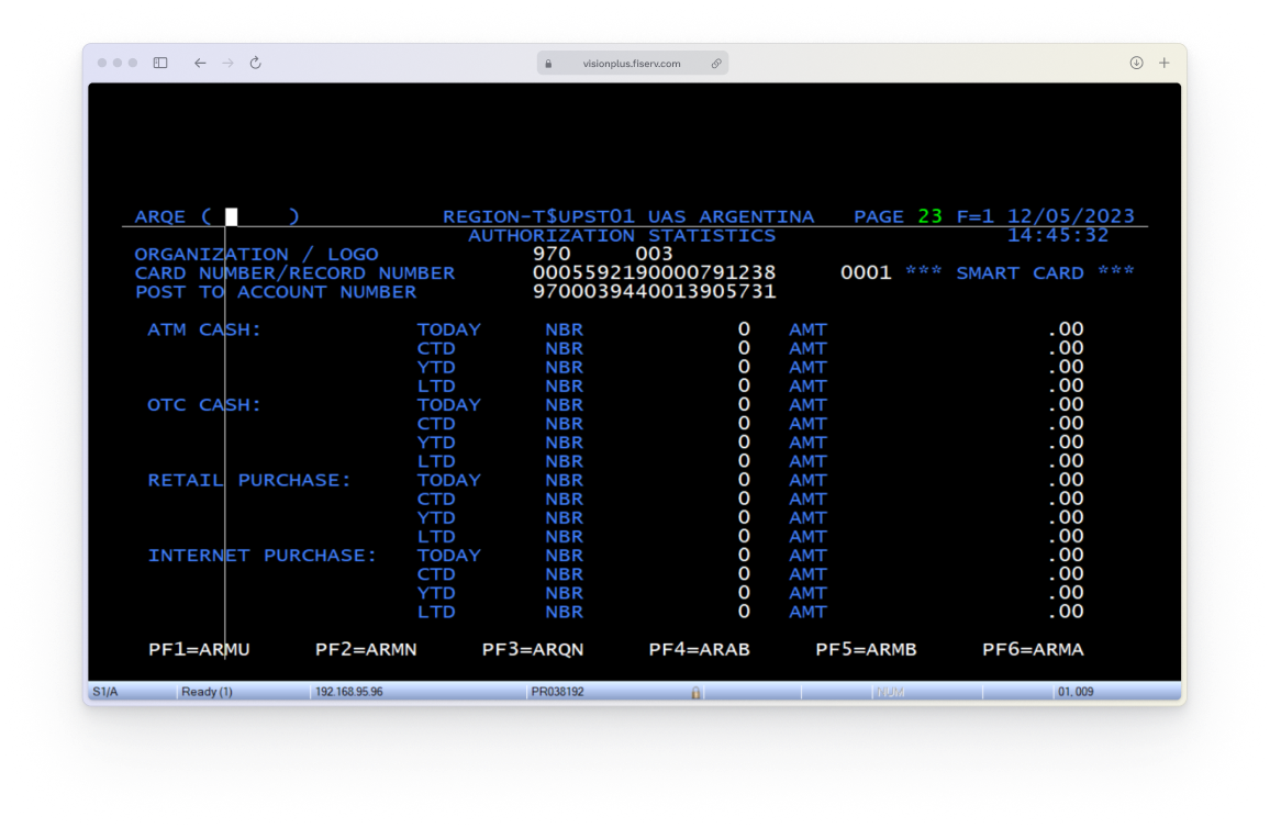
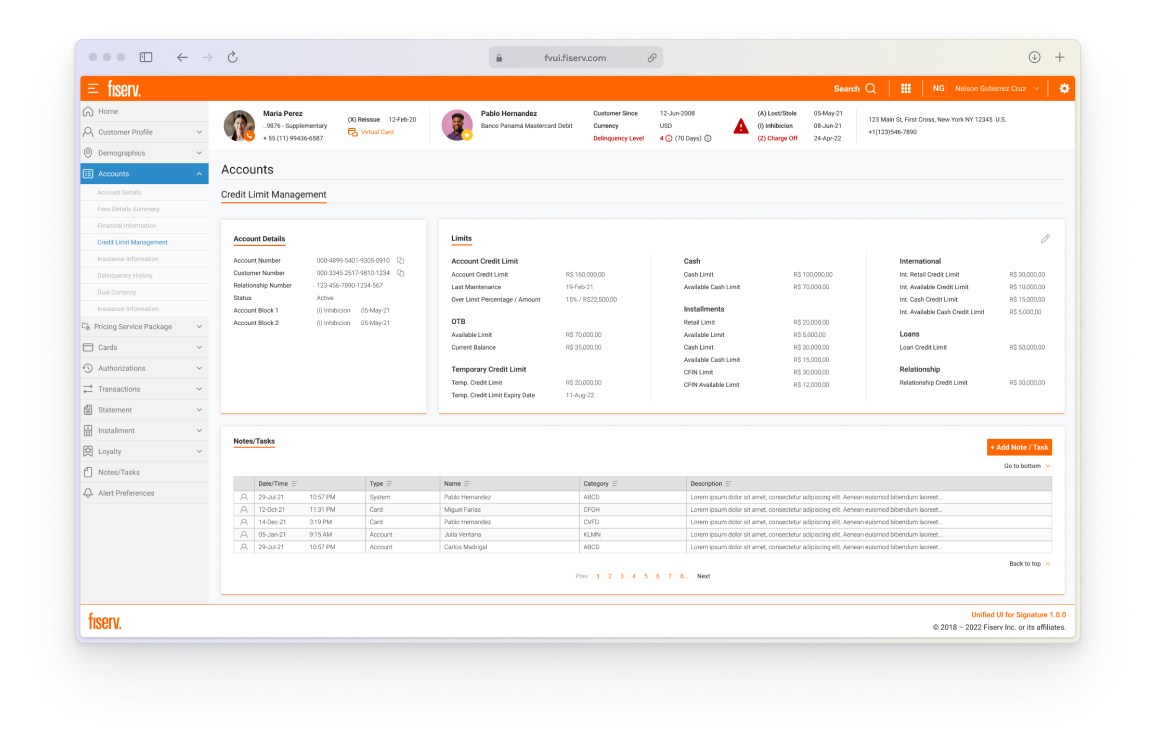

Every limit task took support teams 15–19 minutes. To answer a customer's question about a limit, support teams searched 150+ fields spread across many screens and two systems. One task took 15–19 minutes, according to Fiserv's product team (2023, before launch).

Everything the old systems showed had to stay. All fields from VisionPLUS and the FirstVision MVP had to move into the new feature. Mexico and Argentina had their own rules. Validation was limited to the ASQ, a questionnaire answered after each task. The job was not to remove fields, but to make 150+ of them easy to read.

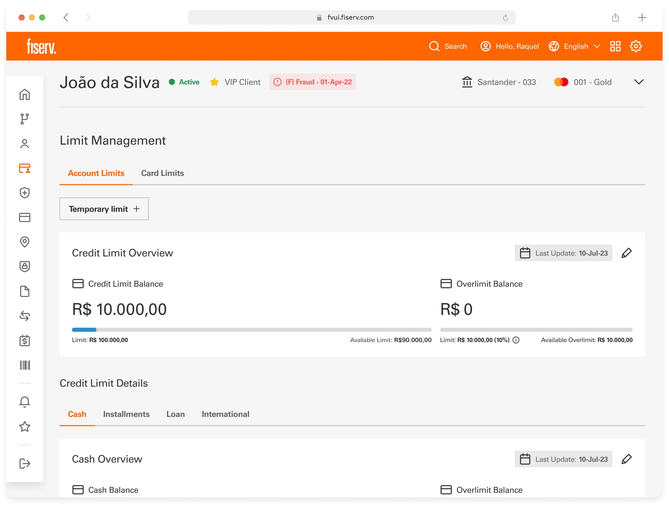
Every limit task now takes support teams 1.5 minutes. One feature holds all 150+ fields, split into account limits and card limits and grouped by category. After launch, the same tasks took 1.5 minutes, down from 15–19. Reported by Fiserv's product team (2023, after launch).
Product and engineering worked from documents, so I started with one. It framed the problem but did not show how to group 150+ fields. The same questions, asked in a FigJam session, did. The map below shows each step and who led it.
Steps with a lock cannot be shown or shared.

Led by me


Led by me

Used to design the key flows
and edge cases

Led by me, with product, dev, design & engineering.

By me

By me

Me and a colleague

I led the design of the key flow and onboarded a colleague

Led by me

UXR-led. I built the prototype and drafted the test script

UXR-led

By me
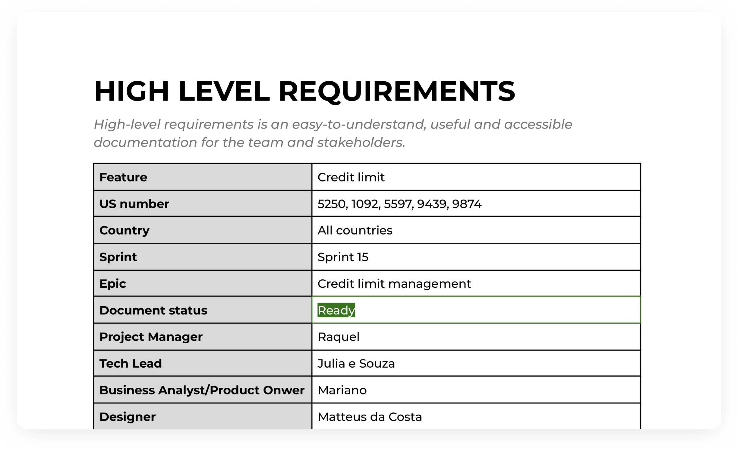
The high-level requirements asked the team: the problem, the situations where the feature is used, what stays out of scope. The session around the doc had little energy, and it did not show how to group the fields.
So I kept the questions and moved them to a FigJam board. In one session I facilitated, product, development, design and engineering sorted the fields into categories. That grouping became the structure of the feature: account limits and card limits, with the fields in each one grouped by category.
 Information is limited.
I wrote one user scenario for each main task and used them twice: to generate design alternatives after the card sorting, and to build the usability test.
Ensuring clarity and ease of access for locating information on available and utilized credit limits.
Identifying and understanding the temporary limit panel and its edit function is essential for effective limit management.
Identifying the credit limit details area, including the dedicated limits, and clarity in the international limit.
Locating and understanding the account overview block and identifying the overlimit status.
The UX researcher ran the test in September 2023. Five Fiserv support agents did four tasks and answered the ASQ after each one. All five checked the available limit (4.9 out of 5). Overlimit was the hardest: two could not finish (3.3 out of 5).
The report closed with six recommendations: rework the overlimit tag, remove repeated information, rethink the edit button, revisit the temporary limit block, give access to the transaction list, and confirm every edit.
Limit management opens on Account Limits: two bars for the credit limit and overlimit balances, and tabs that split the details by category.
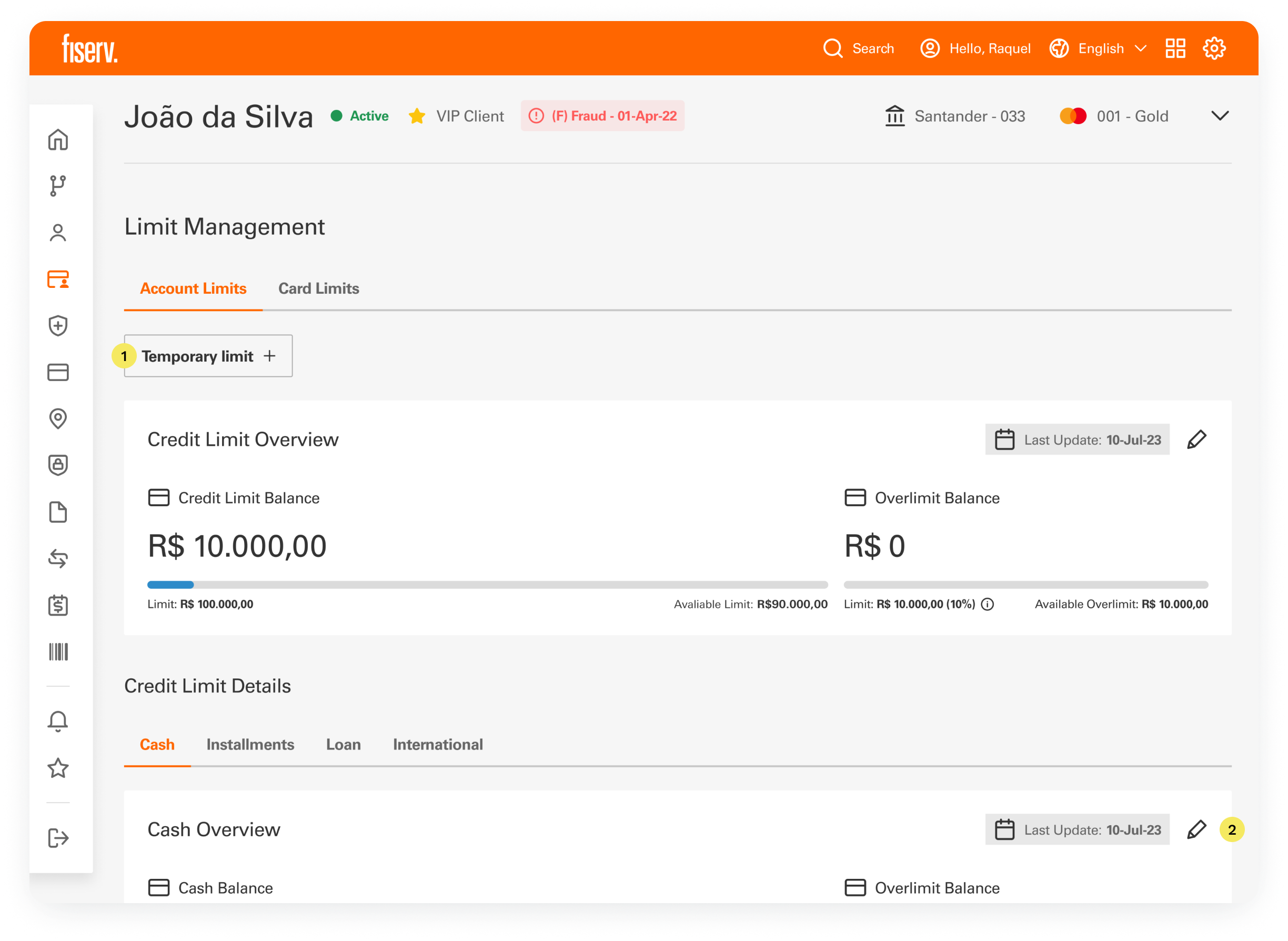
Participants missed a clear way to add/edit the temporary limit. So a dedicated button was placed at the top of the page.
 Usability test recommendation
Test participants were unsure which limit the pencil belonged to, so each block has its own edit icon, next to its last update date.
Usability test recommendation
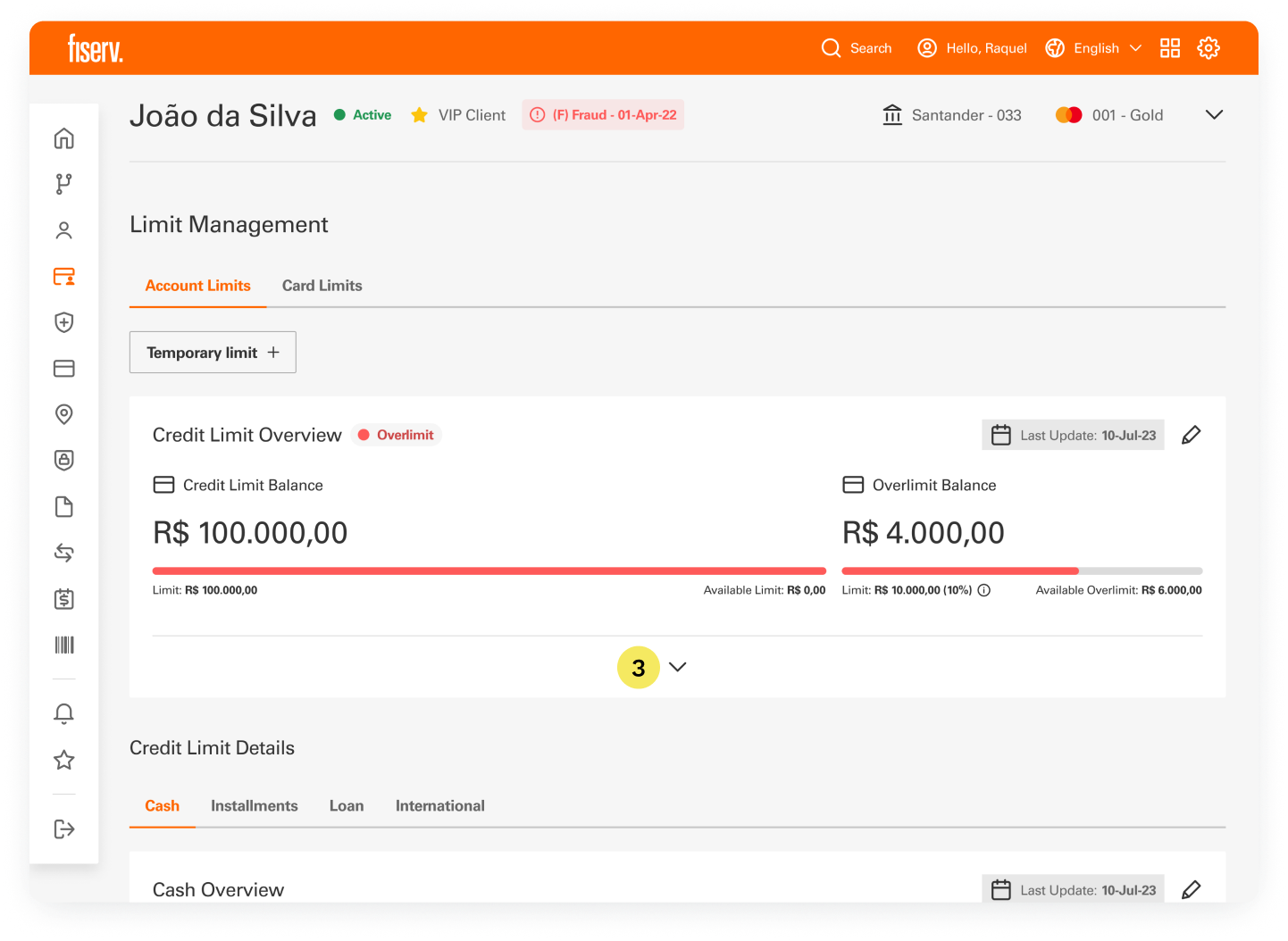
Shows a red tag and a red balance bar. Details stay behind an arrow, so the screen only grows when needed. A participant suggested this.
Usability test recommendation
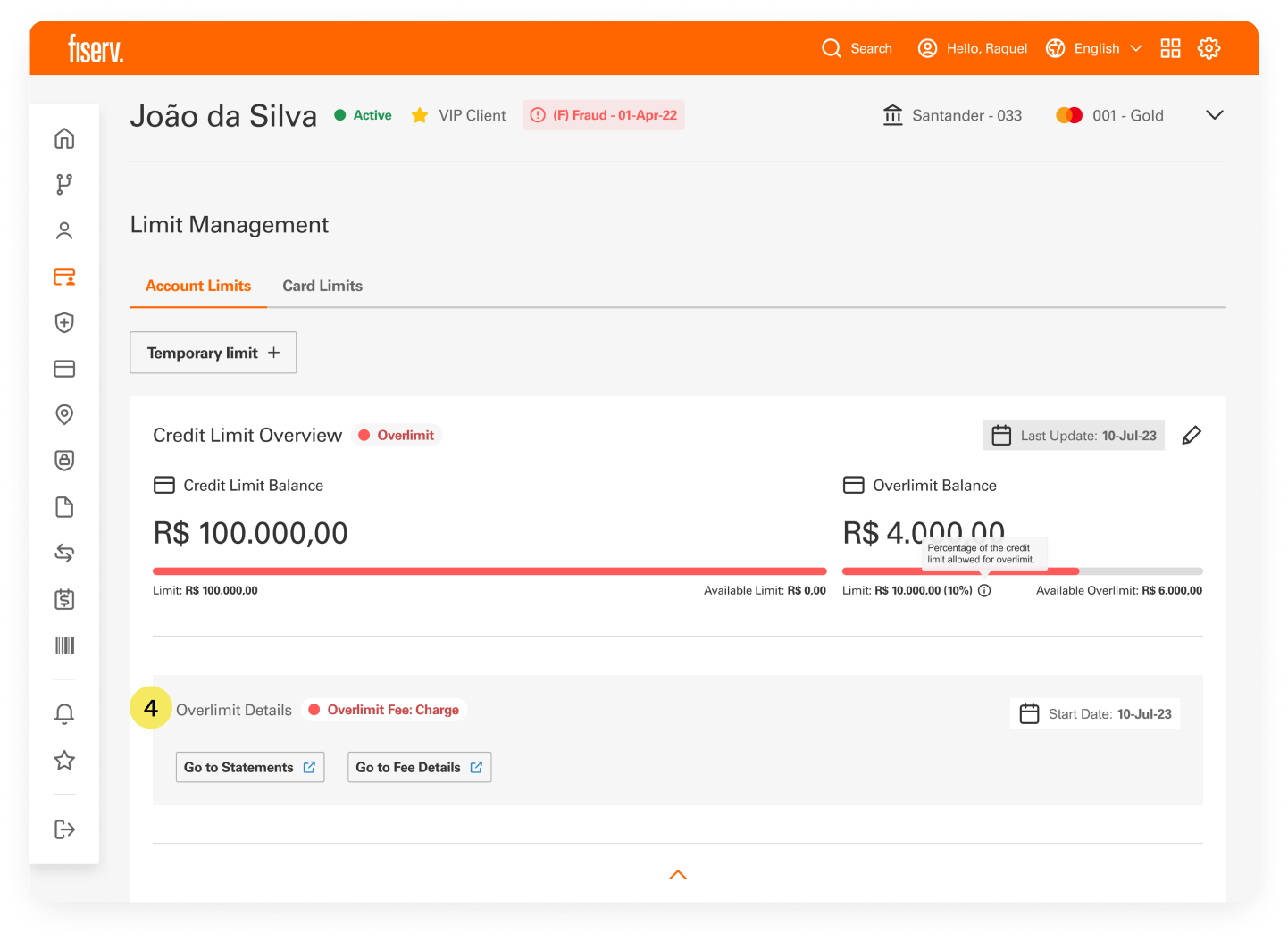
Shows the fee status and start date, with links to Statements and Fee Details. In the overlimit task, four of five participants asked for the transaction list.
Usability test recommendation
Editing opens in a modal over the same screen, one limit at a time.
Each field states what is allowed before the agent submits.
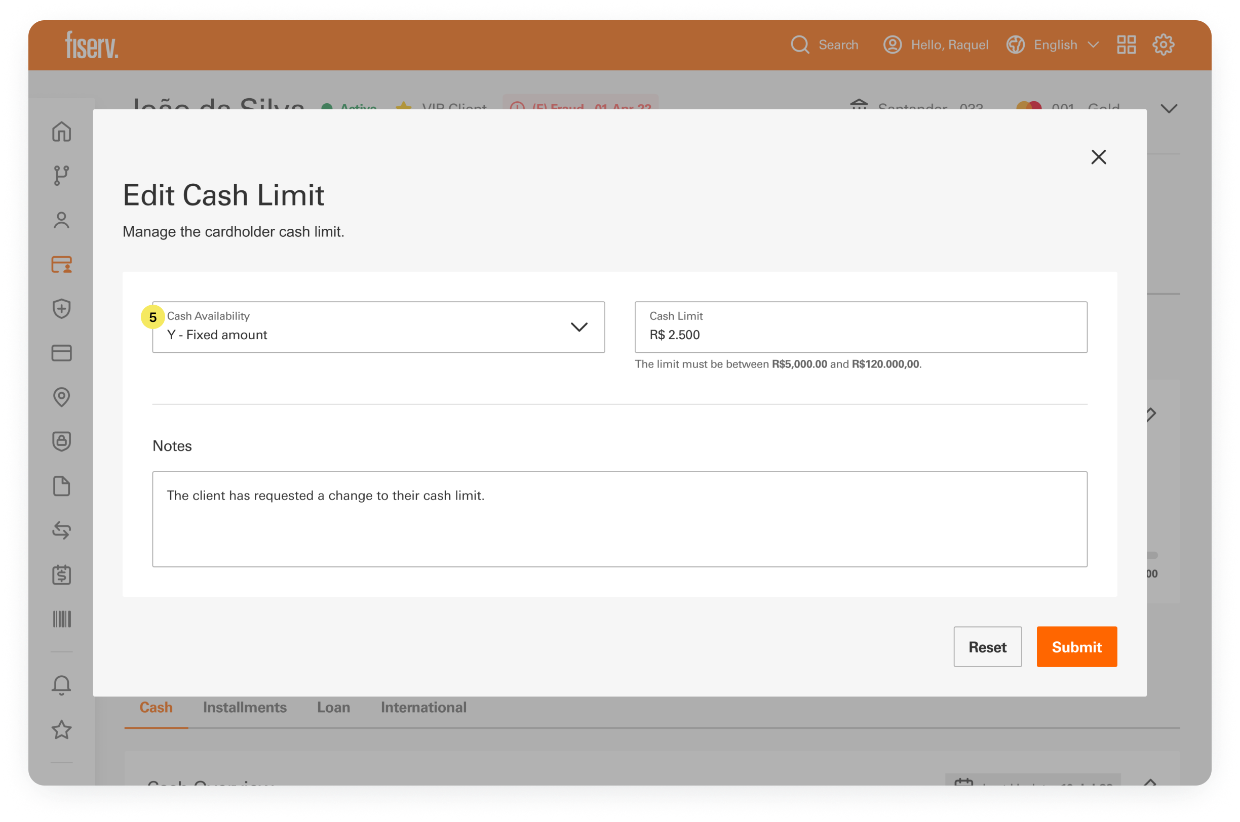

A dropdown sets the type, and the amount field sits beside it, with the allowed range below. In the test, a participant editing the international limit found the options confusing and wanted to type a value.
Usability test recommendation
Fields that do not apply are disabled and fill themselves in. The ones that do apply open for input and show the allowed range.

No limit available: Cash Limit is disabled and shows R$ 0,00.
Total account limit: Cash Limit is disabled and shows the account limit.

Fixed amount: Cash Limit opens for the amount, with the allowed range below.
Each modal names the limit about to change, to prevent mistakes.
Usability test recommendation
Are you sure you want to edit the account credit limit?

Confirmation for the account credit limit.
Are you sure you want to edit the cash limit?
Confirmation for the cash limit.
A customer is traveling and needs extra limit for a set period. For that, the temporary limit has its own block on Account Limits.
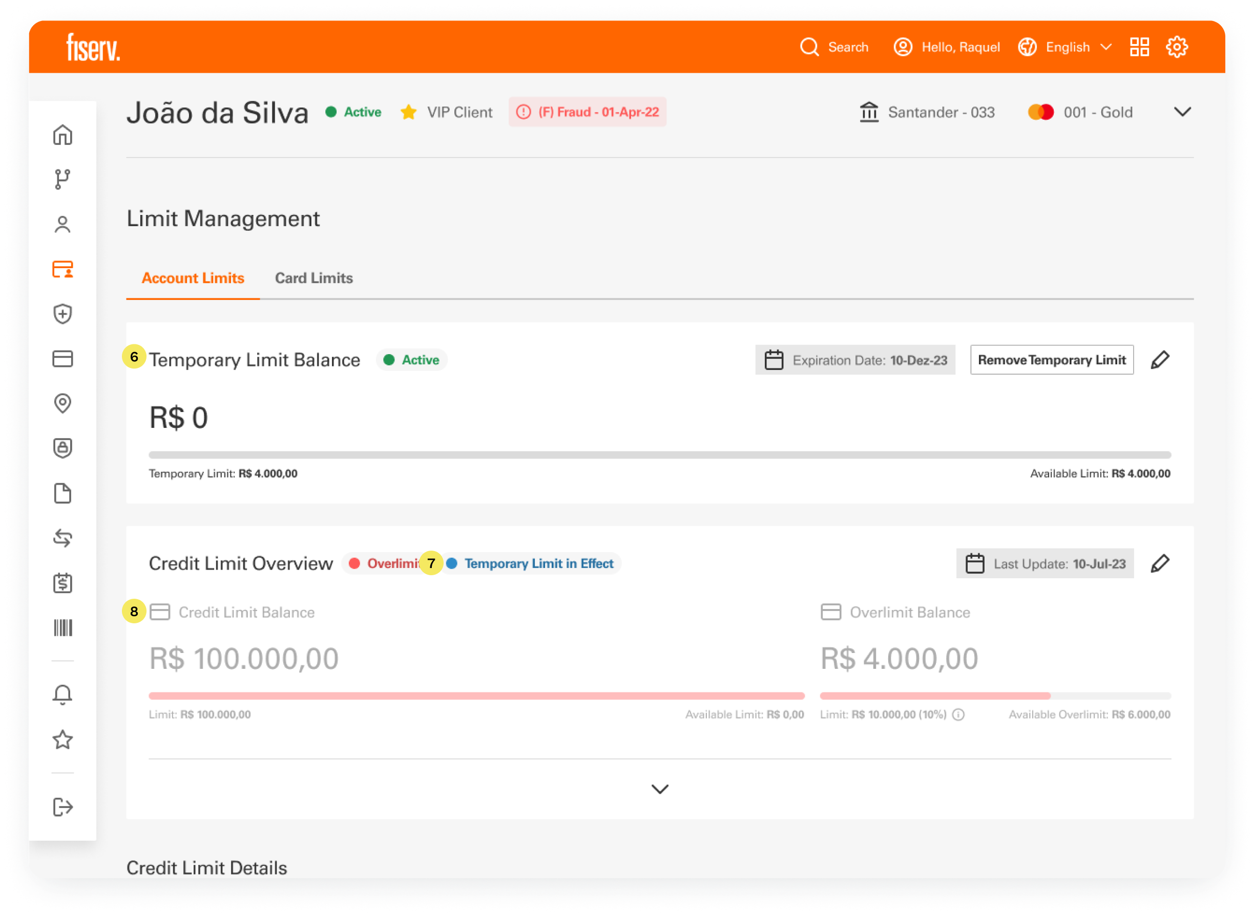
Participants read the old panel as a limit to activate, not one already set. So I decided to create a new block, with a status tag, the expiration date, and edit and remove actions.
Usability test recommendation
A blue tag next to the Credit Limit Overview title shows when a temporary limit is active.
Usability test recommendation
While a temporary limit is active, the Credit Limit Overview fades, so the agent always knows which limit is in force.
Usability test recommendation
Card Limits is the second tab. Specific limits per card start switched off. Once a toggle turns them on, the agent picks a card and sees its limits by transaction type.
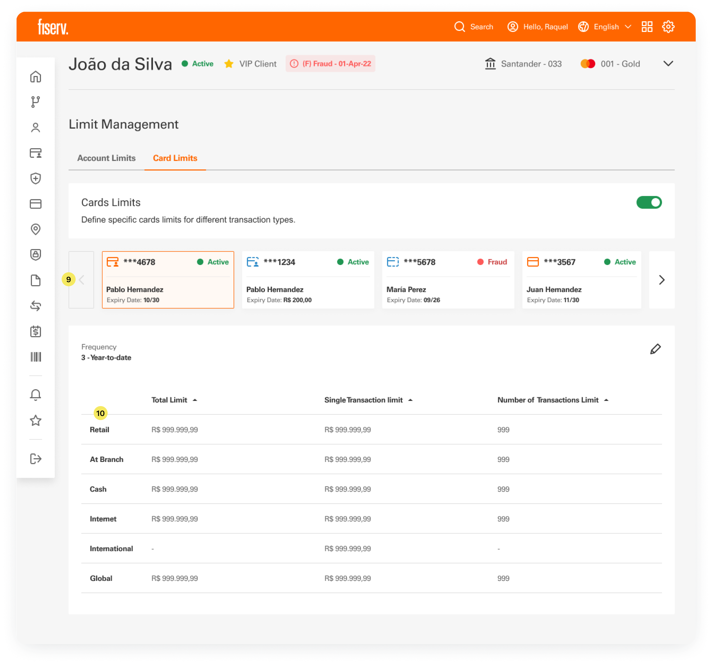
A carousel holds the account's virtual, physical and additional cards. Picking one keeps the agent on the same screen, and the table below shows that card's limits.
The table lists each limit by transaction type. Frequency sets the period it covers.
Limit management was the test for a new design process: working sessions instead of documents to read. It became part of Fiserv's design process in Latin America, for feature development and large redesigns. The team's estimates, before and after:
These are estimates, not measurements.
 Kickoff meetings: 2 hours → 1 hourDesign: 6–8 weeks → 3–4 weeksReady for dev: 4 sprints → 2 sprints
 A document frames the problem.
One named the problem, the other grouped the fields. When the goal is to decide something together, I now choose a shared activity over a document to read.
 Test with the people
The participants were Fiserv support staff. The report notes they lacked the day-to-day context of end users, which may explain the wish for a transaction list and the doubts about the international limit.
 Card limits and the
Card limits were not tested, and the final design was not tested again. The next step is the one the report recommends: a retest with end users.
2 SaaS tools became 1 platform where store managers receive orders and run daily operations, now live in 13 countries.
Read case
One question after the postcode let customers in reach finally order, and almost ended boxes that could never arrive.
 Read case