

Unifying the leading Latin America credit & account limit management, now 70% faster
Customer support teams had to chase 150+ credit limit fields across a mainframe, screen by screen, while handling live...
 Read case

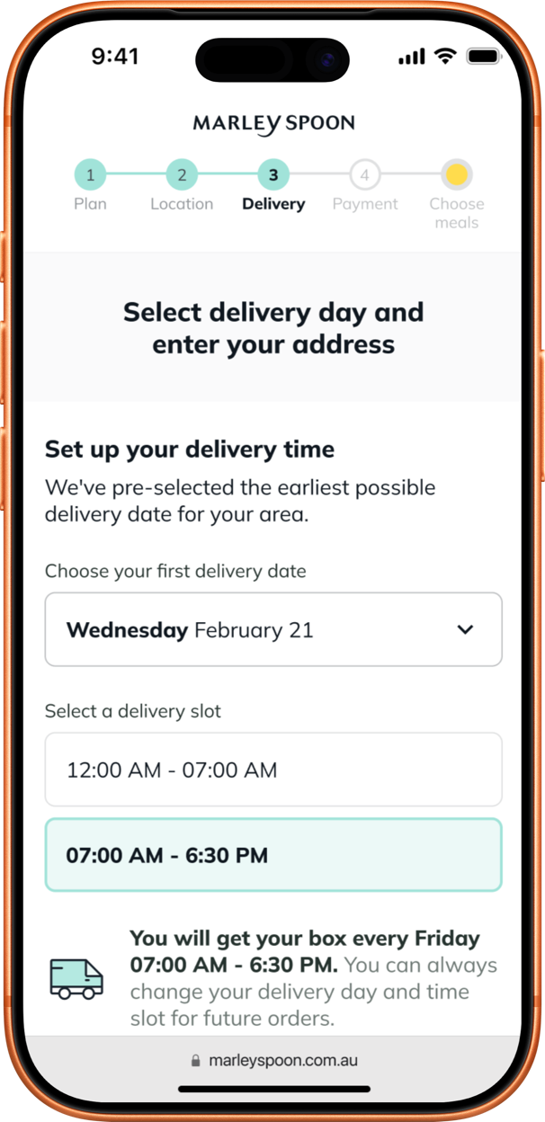
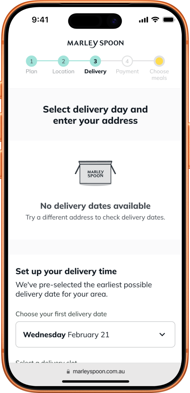
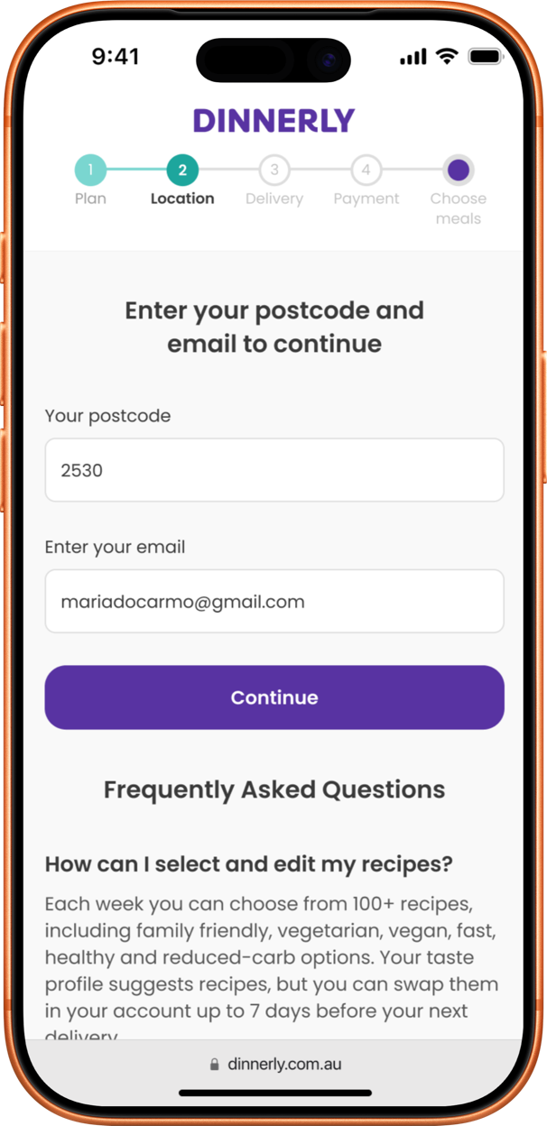
A new step in the sign-up funnel that checks delivery by suburb instead of postcode. In regional Australia, one postcode can be 300 km long and hold both empty areas and towns of 30,000 people, so the postcode alone couldn’t say who was within reach. The step runs on two brands, Marley Spoon and Dinnerly.

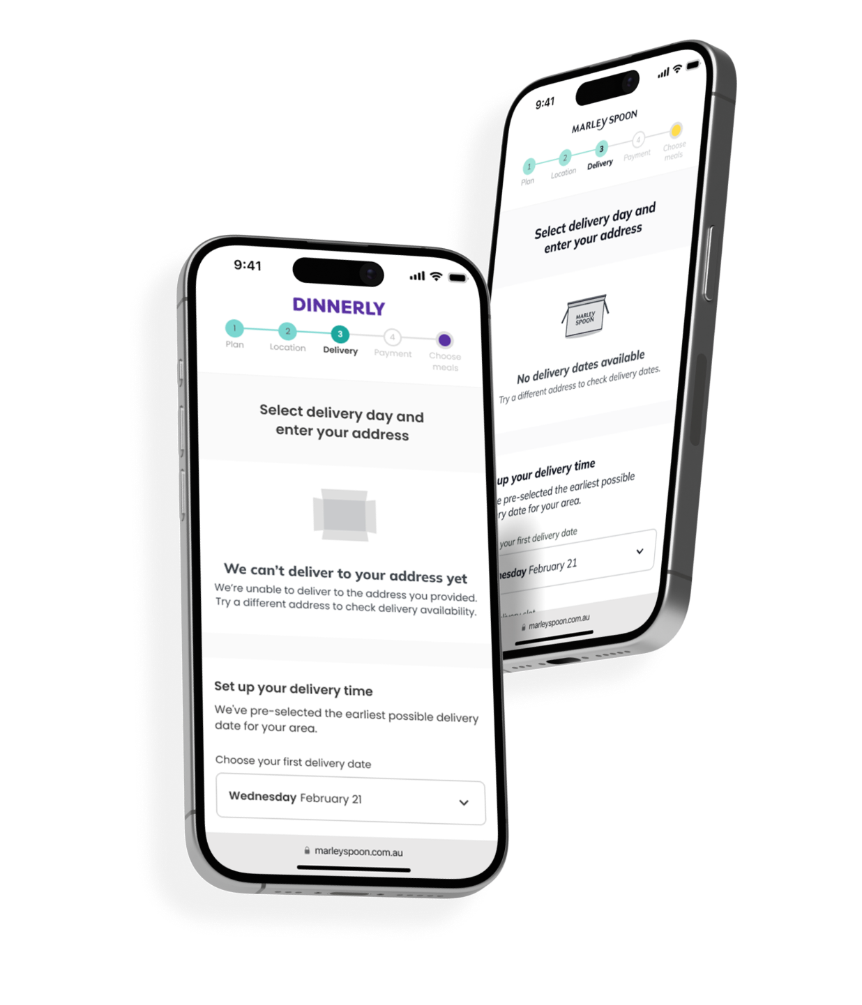
 Unavailable
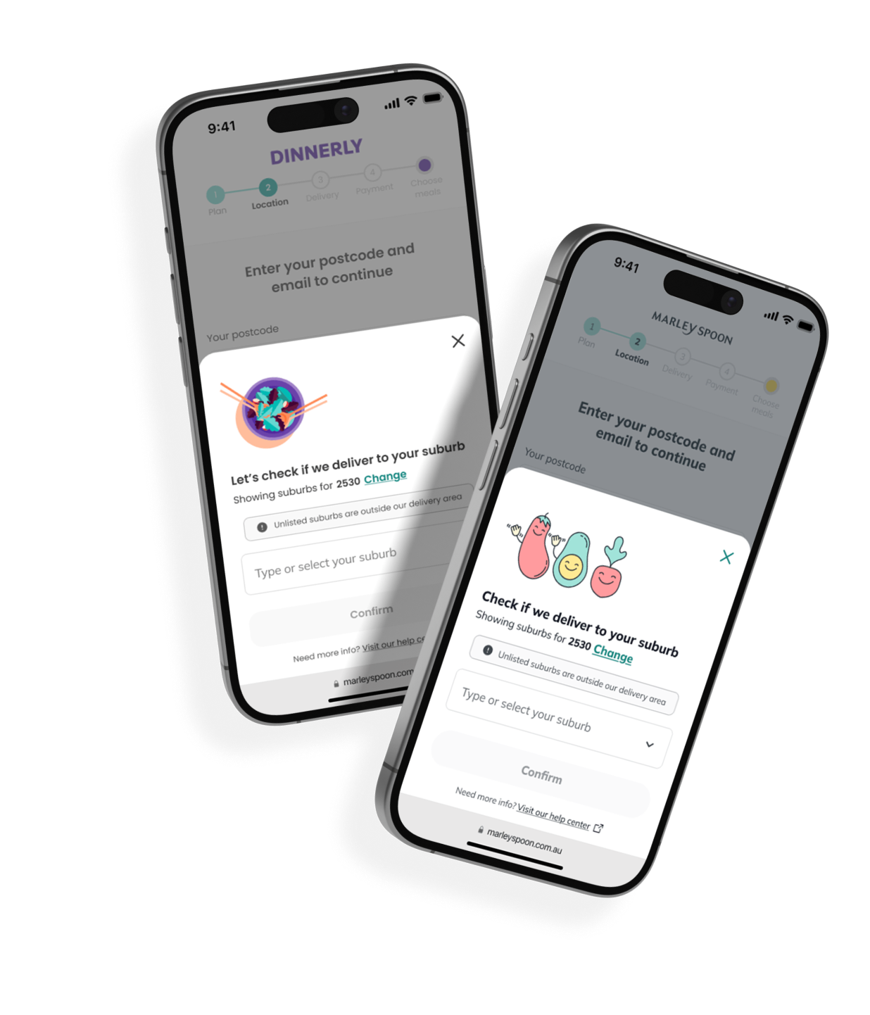
 Available

Reachable customers turned away. The funnel checked delivery by postcode, but the delivery partner worked by suburb. People in suburbs within reach were told there was no delivery available.
Boxes that never arrived. Orders from suburbs out of reach were still produced, then wasted, returned and refunded. Estimated cost: over US$200,000 a year.

The customer had to choose. A postcode doesn’t say which suburb someone lives in. The customer had to pick it, and pick it right.
No friction for everyone else. Customers in fully covered postcodes had to keep the funnel they already had.
Build to scale. The MVP covered a few postcodes, but one postcode could hold 20 suburbs. The selection had to work at that size.

Reachable customers can order.
They selected their suburb in the funnel, and 22% of them became subscribers.
Almost no undeliverable orders.
Customers out of reach find out before ordering, so the box is never produced.

I compared 5 meal-kit competitors in Australia: how customers picked their location, what they were shown, and how the system answered.
All five left the suburb for last: one more field in the delivery details, filled in by the customer alone. Asking earlier, and helping the customer choose, was the opportunity.
One session with product and engineering to agree on requirements and edge cases before scoping.
We dropped the quick fix of adding the suburb to the delivery details page and agreed to ask earlier. “No slots yet” and “no delivery at all” would get different answers.

I mapped the sign-up funnel step by step to see where delivery was decided and where the suburb was asked.
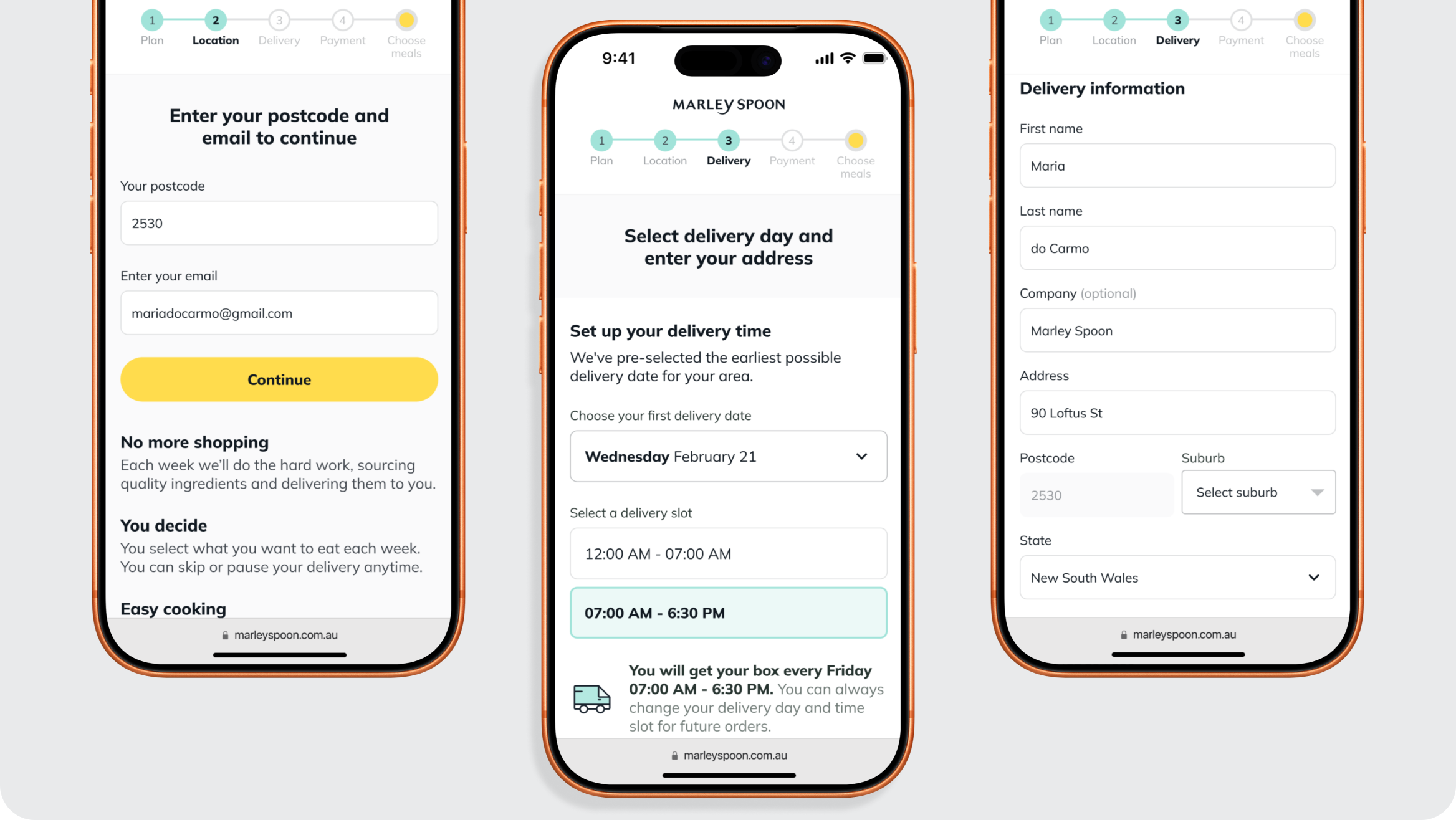
Customers got a yes or no on delivery from the postcode alone. The suburb was only asked later, in a long form, when the answer had already been given. It had to come right after the postcode.
I mapped every path a customer could take from a partly covered postcode, to settle the logic before designing any screen.
Fully covered postcodes skip the new step. Partly covered ones ask for the suburb right after the postcode. Once the customer picks it, postcode and suburb are already filled in on the delivery form.
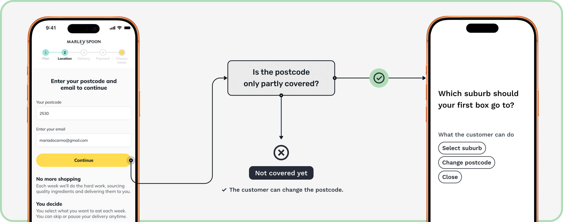

If the suburb is asked right after the postcode, more customers can be served without losing sign-ups along the way.
After postcode and email, a bottom sheet slides up and asks for the suburb. It only appears in partly covered postcodes, and it works with a familiar pattern that the customers already use on their phones.
An extra step can make people leave. So postcodes with a single suburb skip it, and the title says why the question is being asked. A wrong postcode sends the customer straight back to the postcode field, ready to type, not to the start.
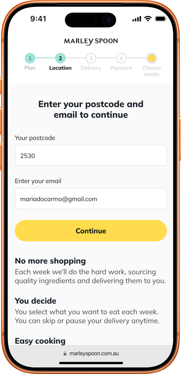
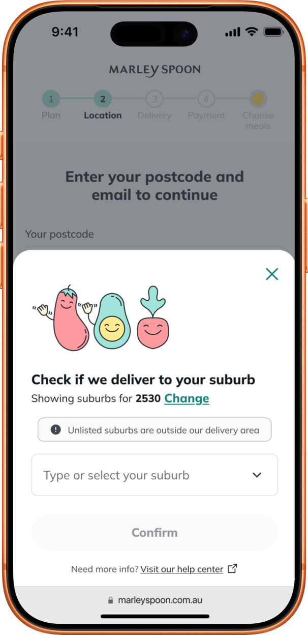
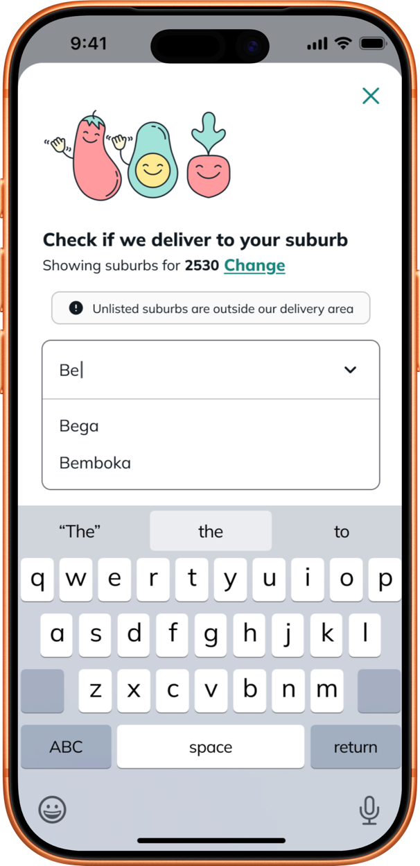
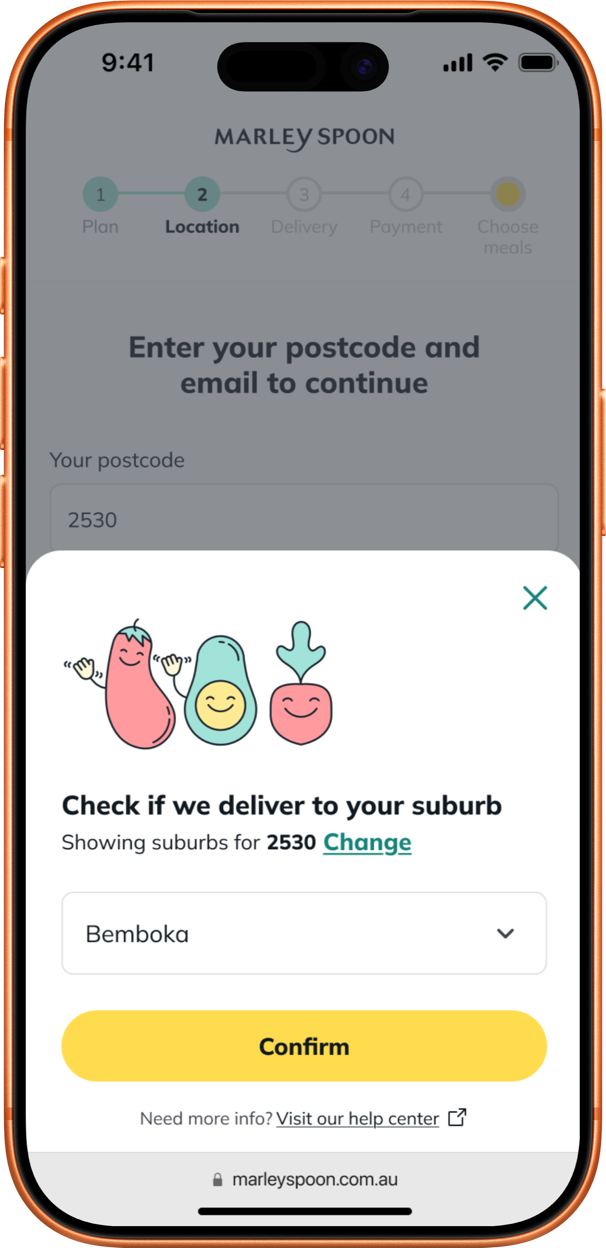
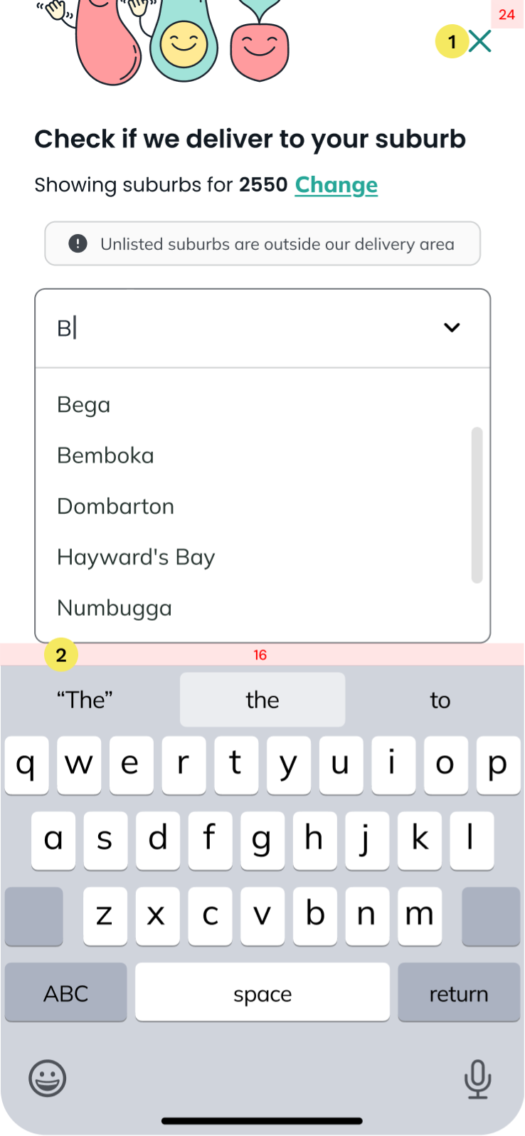
The margin is 24px from the right and top edges. The X stays fixed, keeping its margin, when the user scrolls.
The bottom line of this component must be 16px from the keyboard.
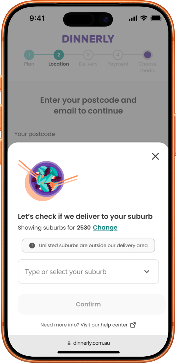
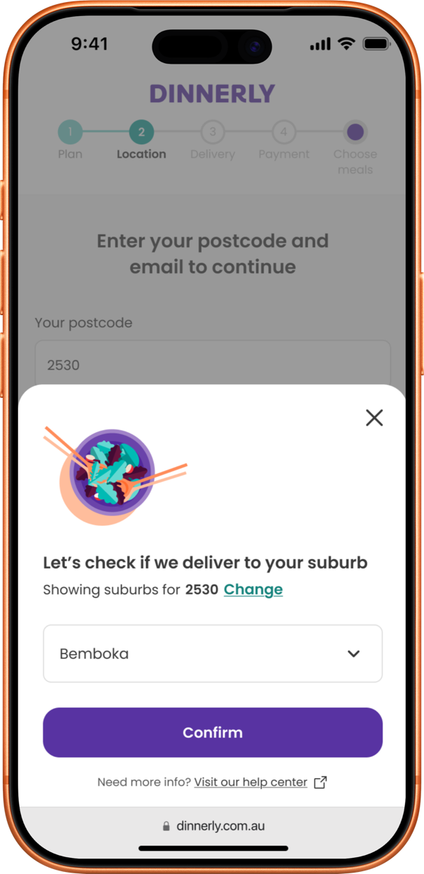
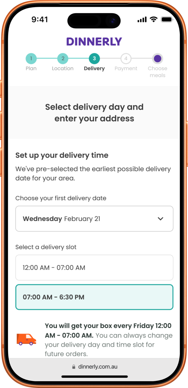
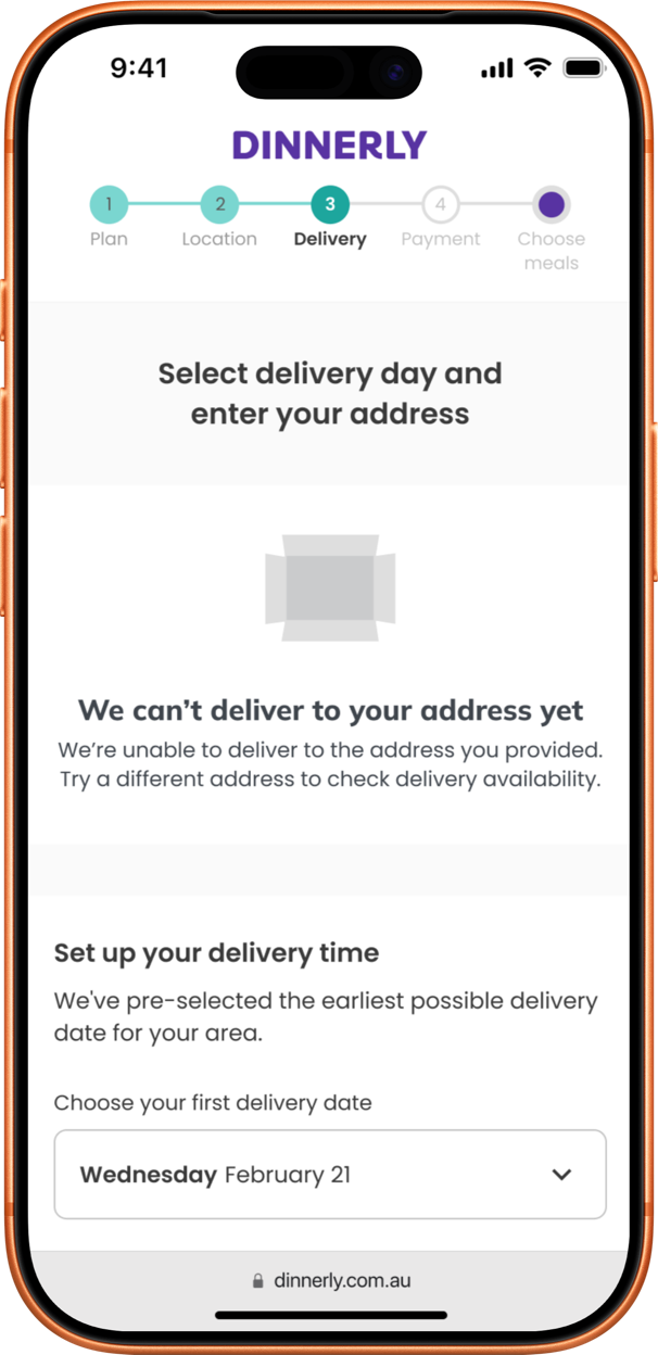
Checking delivery by suburb, right after the postcode, answered both sides of the problem. A two-week A/B test confirmed the new step didn’t hurt sign-ups, and the full rollout followed.
In 12 months, from customers within reach.
Before: they were turned away when their postcode was closed.
And 20K orders in the same 12 months.
Before: no way to order inside a closed postcode.
Customers out of reach find out before ordering.
Before: an estimated US$200K+ a year in failed orders.
 Metrics are rounded for compliance.
More than one in five customers who saw the suburb step.
Most likely customers whose suburb isn’t covered yet.
The extra question cost almost no sign-ups.
 Question the default early
The first idea was to add the suburb to a page the team already had. It was the cheapest fix, but it would have told customers too late. Comparing it with the customer’s path in the first session changed the plan before any screen was designed.
 The 18% is the next question
Almost one in five customers closed the panel. Most likely their suburb isn’t covered yet, and the MVP only let them change the postcode. The next step is to let them say they’re interested, so the business can see where demand is.
 Share what the data shows
Customers from these suburbs spent about US$98 per order, in line with the business case and steady across 12 months. I passed this to marketing, so paid acquisition could target those suburbs.
Customer support teams had to chase 150+ credit limit fields across a mainframe, screen by screen, while handling live...
Read case
A trustworthy, scalable experience. The store manager tool is part of a platform now live in 13 countries.
 Read case